
Tower of Babel
Wikipedia
http://en.wikipedia.org/wiki/Tower_of_Babel
***
"The limits of my language," the philosopher Ludwig Wittgenstein once posited, "mean the limits of my world." Explaining everything within the limits of the world is probably too ambitious a goal for a list like this. But here are 23 maps and charts that can hopefully illuminate small aspects of how we manage to communicate with one another.
-
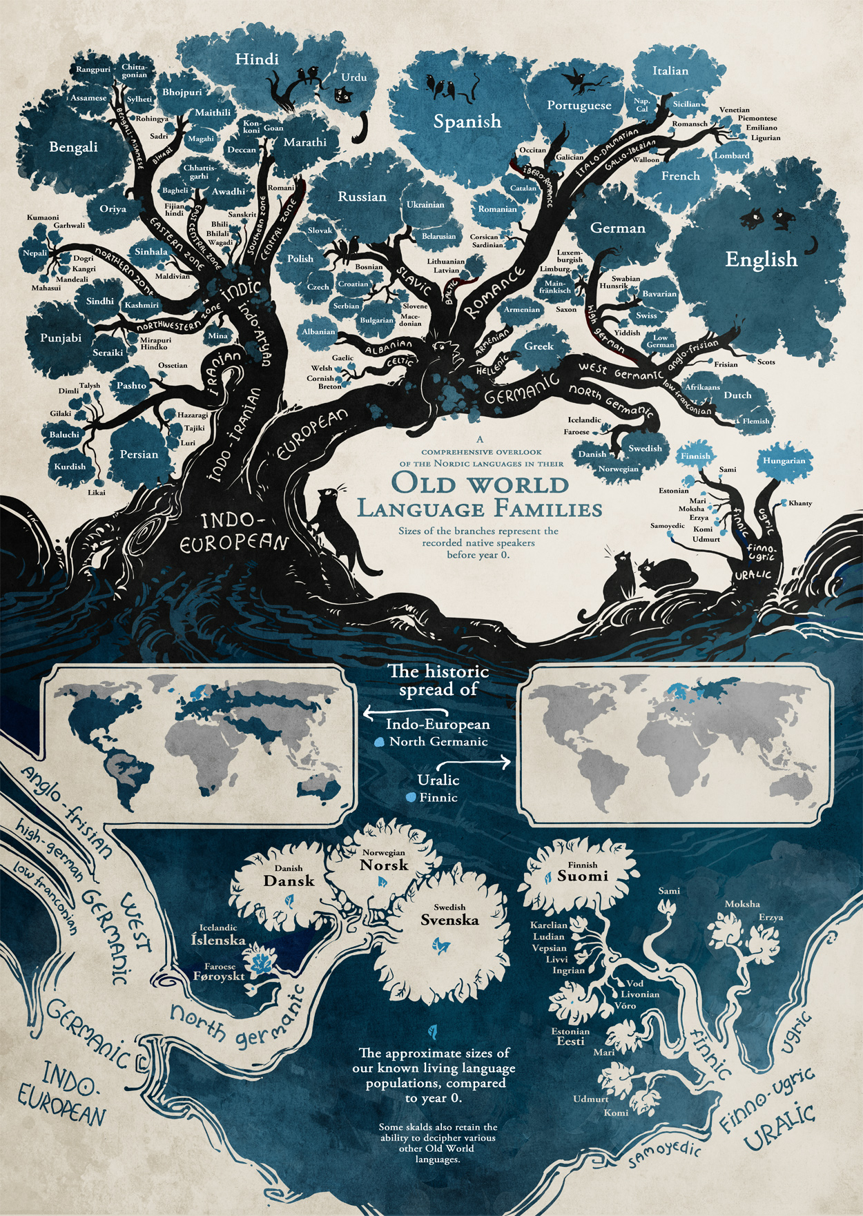
Indo-European language roots
Minna Sundberg, a Finnish-Swedish comic artist, created this beautiful tree to illustrate both the relationships between European and central Asian languages generally, as well as a smaller but still striking point: Finnish has less in common with, say, Swedish than Persian or Hindi do. The latter two are Indo-European language, even if they branched off more quickly, whereas Finland is Uralic. -
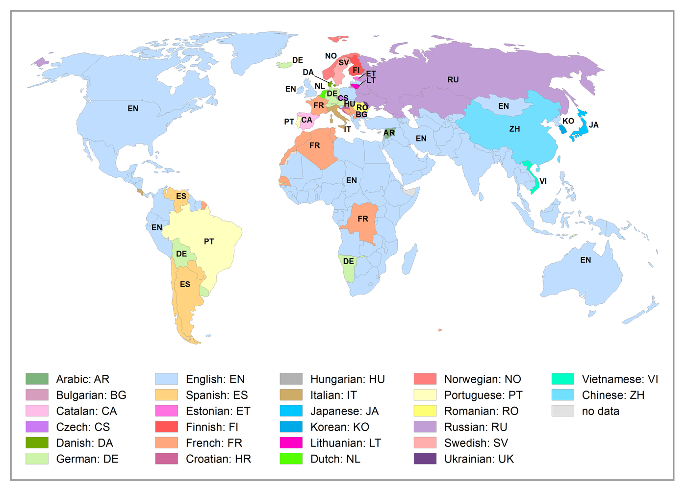
The languages of Wikipedia
This map shows the language in which the plurality of Wikipedia articles on a given country are written. Some countries match up. Articles about European countries tend to be mostly written in their languages (though intriguingly Catalan is the plurality language for articles about Spain, perhaps because of an old breakaway competitor to Wikipedia in that country). Same goes for East Asian countries and the US.But a whole lot of countries are most commonly written about in English, and not just countries where English is a major language. There's not much reason for English to be the most common language for articles about Mongolia, for example. Out of all the world's Arabic speaking countries, only Syria appears to have Arabic as its most common Wikipedia language.German has footholds in Bolivia, Uruguay, and Namibia. These make some degree of sense; Germany colonized Namibia until World War I (committing the first modern genocide in the process) and a small German-speaking population remains today, while Bolivia and Uruguay have small German-speaking communities that migrated in the late 19th and 20th centuries. But really, most articles about Bolivia ought to be in Spanish.Joey Stromberg has more on Wikipedia's geography and language problems here. -
The language groups of the world
This map colors regions not by specific language but by the general family to which the dominant language belongs. So France, Romania, Italy, Spain, and Portugal all get colored the same (as does Latin America, apart from tribal languages), and the Anglosphere gets lumped in with Germany, Denmark, the Netherlands, Norway, and Sweden. But the map also illuminates differences within countries. India has a noticeable split between Hindi speakers and speakers of Dravidian languages, the latter of whom are concentrated in the lower part of the country. China's Chinese-speaking, heavily populated, industrialized eastern half contrasts sharply with both Tibetan speakers in the southwest and Turkic speakers in the northwest. -
Romance languages
This diagram, by Russian linguist Yuri Koryakov, digs deeper than the above tree into the relationships between various romance languages. Langues d'Oïl, on top, is an umbrella category that includes French; the name comes from the word for yes (it has since evolved into "oui" in modern French), which sets the languages apart from languages like Spanish or Italian whose words for yes derive from the Latin "sic." The most interesting items on the diagram are lesser-used tongues, in particular Sardinian, which stands out as the modern language closest to Latin in pronunciation. -
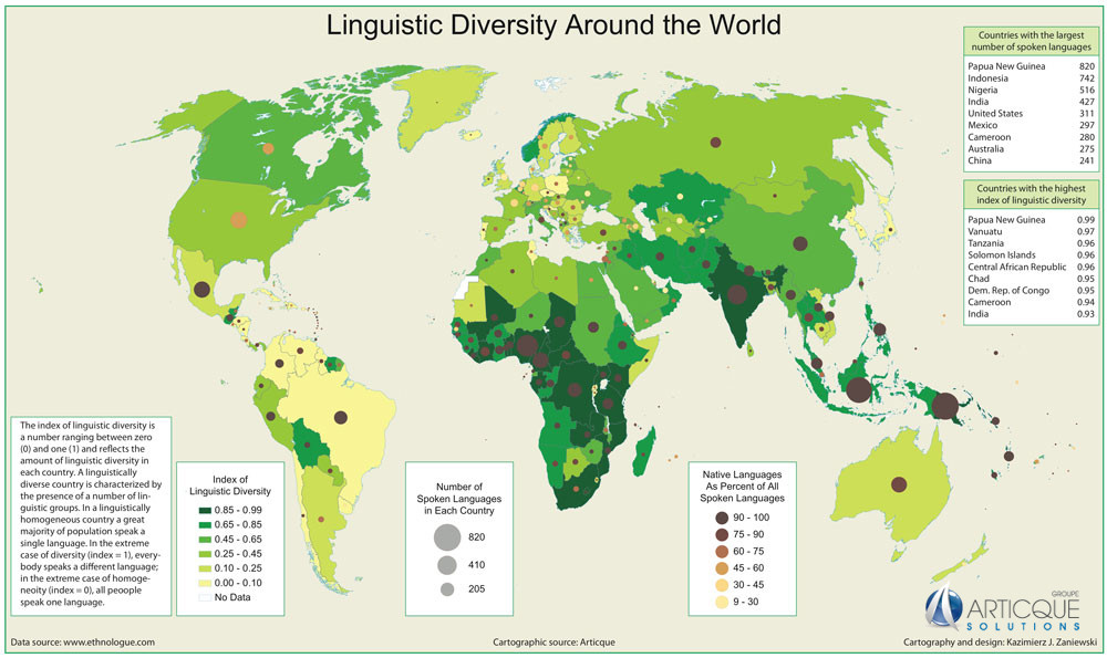
Linguistic diversity around the world
This map — created by University of Wisconsin Oshkosh's Kazimierz Zaniewski using data fromEthnologue — shows the level of linguistic diversity in various countries, where a score of 0 means everyone speaks the same language and a score of 1 means everyone has their own language. Even though the latter is technically impossible, Papua New Guinea comes pretty damn close with a score of 0.99 -
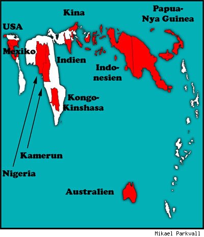
Countries mapped by number of languages
Mikael Parkvall, a Swedish linguist, takes another approach to illustrating linguistic diversity: "rendering each country in a size corresponding to the number of languages spoken in it … The ten shaded countries are those in which more than 200 languages are in use." The clear winner, again, is Papua New Guinea, which has only about 7 million people and over 800 languages. -
China's languages
Most people know that Mandarin Chinese — the official dialect used and promoted by the Chinese government and taught in most Western Chinese courses — is just one of many, and that a variety of other dialects (Cantonese, Shanghainese, Taiwanese, etc.) have millions of speakers as well. The above map illustrates the geographic distribution of the various dialects on mainland China and Taiwan. But perhaps less well known is exactly how different the dialects can be. They use the same character set, and most use Mandarin in writing, but the spoken dialects are often mutually unintelligible. As University of Wisconsin linguist Zhang Hongming once told the New York Times, "The degree of difference among dialects is much higher than the degree of difference among European languages." -
India's languages
Just as many of China's most populous cities (Shanghai, Guangzhou, Shenzhen, Hong Kong) are located in regions where dialects other than Mandarin prevail, many of India's biggest cities (Mumbai, Bangalore, Kolkata) are in states where Hindi does not dominate. This map is a bit outdated — Andhra Pradesh was split up this year, with the city of Hyderabad going to the new state of Telangana — but it's a good indication of the levels of linguistic diversity in the country, which speaks about 780 languages total, and has lost 220 in the past fifty years. -
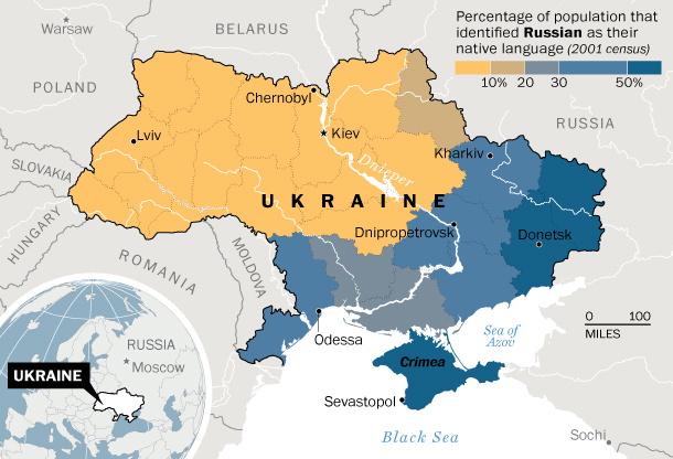
Ukrainian v. Russian
As Max Fisher notes in our card stack on the Ukraine crisis, maps of the Ukrainian/Russian divide in Ukraine look a LOT like maps of electoral results showing where the pro-Russian and pro-Western parties won. The linguistic divide itself is contentious — though some have adapted by having conversations where each side speaks a different language — but it's really more of a proxy for the deeper underlying cultural and political splits that this year's tumults have brought to the fore. -
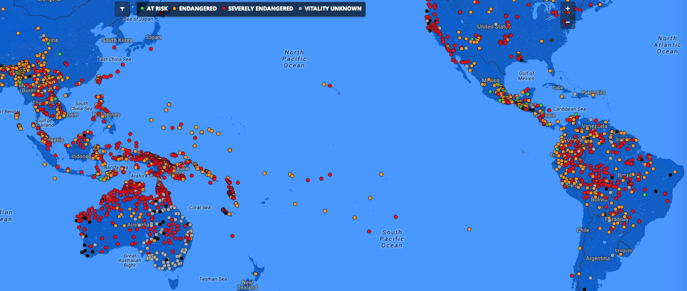
Endangered languages
The Endangered Languages Project — launched with heavy support from Google and now sustained by the LINGUIST List and the First Peoples' Cultural Council in Canada — created this interactive map to document languages in danger of extinction. This screenshot excludes Europe and Africa, which contain significant numbers of threatened languages (Nigeria and East Africa especially), but the heaviest concentrations are in Southeast Asia and Latin America. The map also makes a sobering counterpoint to the previous two, in that it emphasizes how fragile Papua New Guinea's unique linguistic diversity is, given just how many of its sundry languages are in danger of being lost forever. -
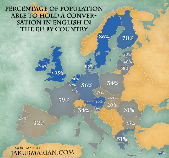
Who in Europe speaks English
Many countries have more than one commonly used language, with many residents learning two or more. And due to both the British Empire and America's dominance of global commerce and culture since World War II, English is often the second or third language people learn.This map shows how common English speaking is in a number of European countries. Strikingly, even in countries where proficiency is comparatively rare, it still makes up a sizable chunk of the population; 20 percent of Hungary and 22 percent of Spain is nothing to sneeze at.But the penetration rates in countries speaking Germanic languages are especially astounding. 90 percent of Dutch people can hold a conversation in English; that's nearly as high as Ireland, an actual English-speaking country.Some of the variation here is explainable by how countries deal with imported television programs and films; in Northern European countries, TV and movies from the US tend to be subtitled whereas in Southern Europe dubbing is more common; the former amounts to a sort of low-intensity English class, if you watch enough TV. -
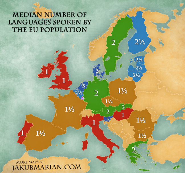
How many languages Europeans speak
Not only are Netherlands highly proficient in English, but the typical Dutch person knows a third language as well, Jakob Marian finds in this map. The term "median" requires a bit of explication here, since obviously there's no person in France speaking 1.5 languages. Marian uses the fraction to highlight countries where there's a close split. "X½ for a country means that between 45% and 55% (i.e. "about one half") of its inhabitants speak X+1 languages," Marian says. "For example, 1½ for France indicates that about one half of the French speak two languages, and the rest speak just a single language." -
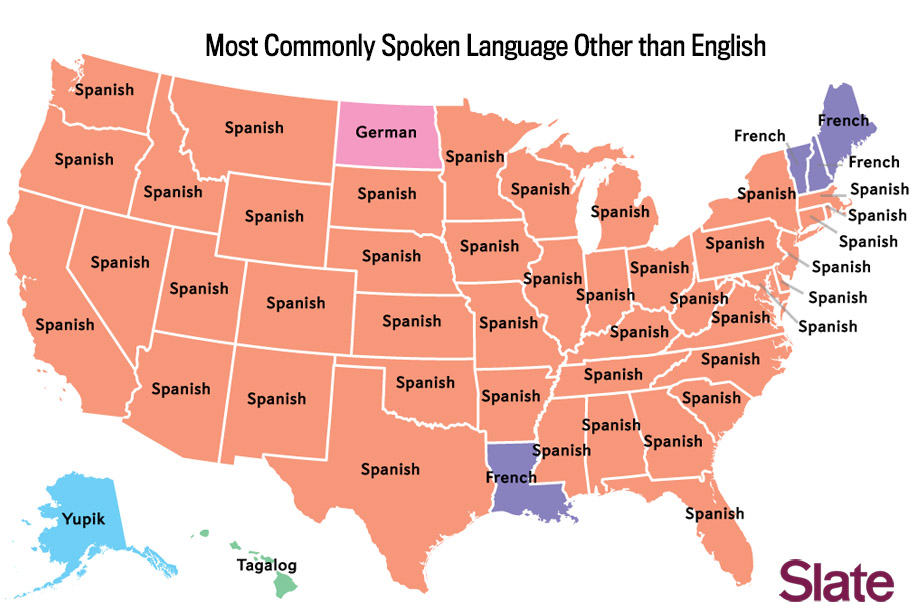
The second most popular language in US states
There's an arguably more interesting version of this map showing the most popular non-English, non-Spanish language in each state, which generates some really interesting findings (Hmong in Minnesota! Russian in Oregon!). But this map conveys what's probably a more important fact about languages in the US: they don't vary as much by region as you might think. Just about everywhere, the second most spoken language is Spanish. There are exceptions — Louisiana and Quebec-adjacent states in New England favor French, for example — but ultimately, the US is a English-speaking country which has had many waves of immigration from Spanish-speaking countries, meaning that most states have sizable first-generation immigrant populations that speak Spanish. -
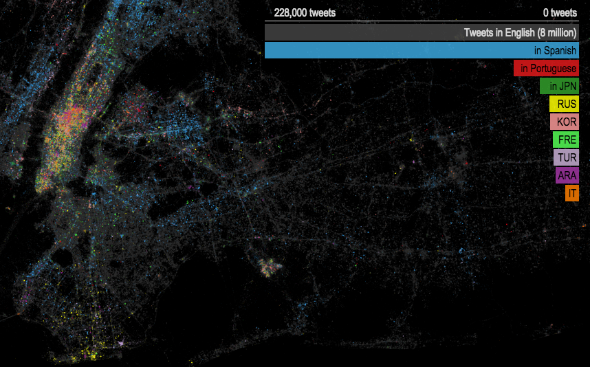
New York tweets, by language
Obviously, the most common language for tweets originating from New York City is English; those tweets are represented in grey on the interactive map this screenshot is taken from. The more interesting data points are the other languages. Spanish is by far the most prevalent, with particular pockets in Queens, northern Manhattan, the Bronx, and Union City, NJ. Midtown Manhattan and JFK airport (the glowing area just a bit below the center of the image) have, understandably, the most linguistic diversity. And you can make out other enclaves: Russian in Brighton Beach, Portuguese in Astoria, etc. (Hat tip to Flowing Data.) -
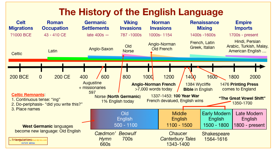
The history of English
While Germanic at root, English has evolved into a hybrid with components from ancient Celtic languages (such as a continous tense, or -ing verb tenses), considerable vocabulary borrowed from Latin and French, and lots of words stolen from Hindi, Arabic, and other languages of British colonies. This chart by Sabio Lantz is a clear, detailed chronology of that process. -
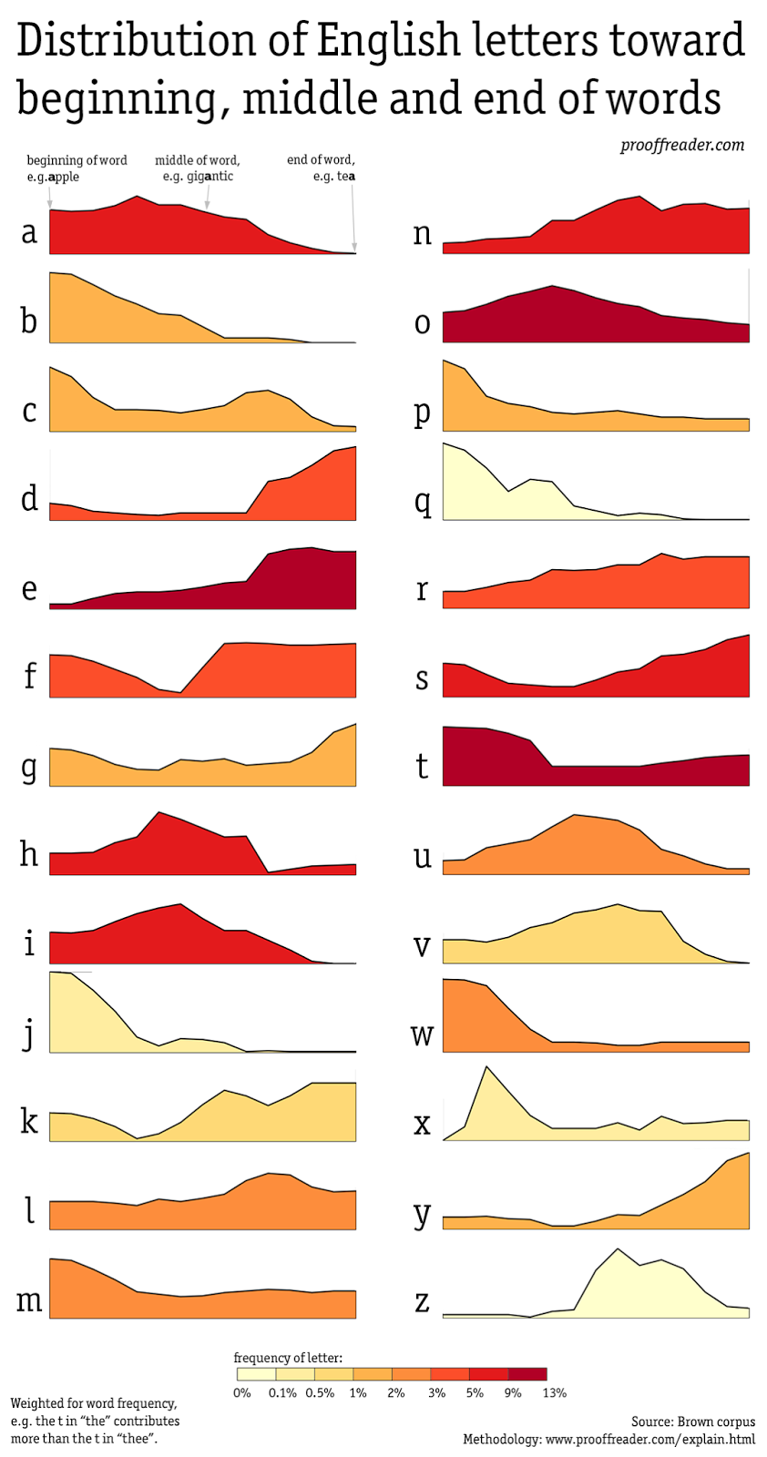
Where letters are used in English
The point that some letters are more commonly used to end words and others to begin them is pretty self-evident, but it's cool nonetheless to see the letter-by-letter breakdown, which this chart by David Taylor provides. -
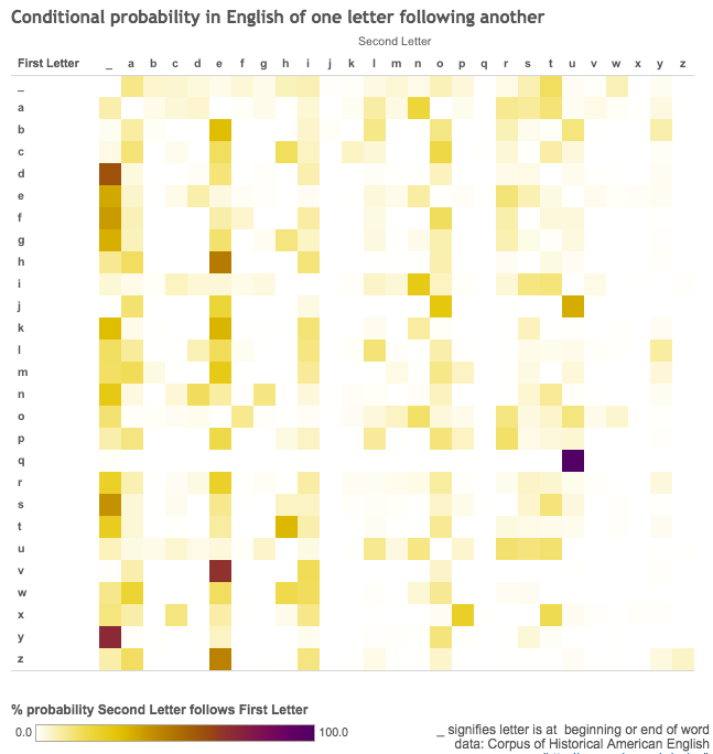
Which letters follow each other
By the same author as the above chart and using data from the Corpus of Historical American English at Brigham Young, this diagram delves deeper and shows the specific probability that a certain letter will follow a certain other letter in a word. The first column and first row are just a test of how frequently the letters in question are used to begin/end words. And naturally the Q/U relationship is quite strong.But I was surprised by how much V relies on E, and by the lack of a clear winner when it comes to starting words. -
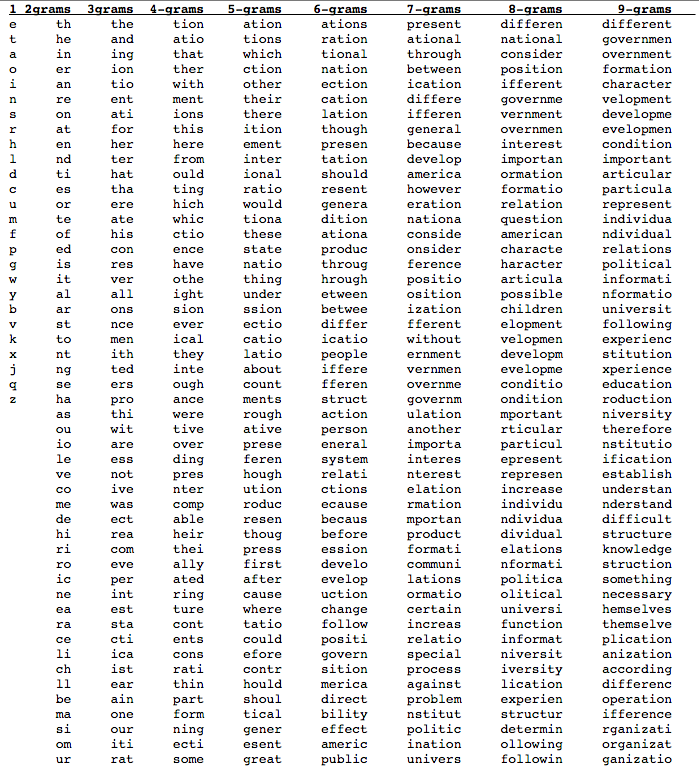
Most common letter combos
"Our language," Stephen Fry once noted, features "hundreds of thousands of available words, frillions of legitimate new ideas … And yet, oh, and yet, we, all of us, spend all our days saying to each other the same things time after weary time: 'I love you,' 'Don't go in there,' 'Get out,' 'You have no right to say that,' 'Stop it,' 'Why should I,' 'That hurt,' 'Help,' 'Marjorie is dead.'"Google director of research Peter Norvig wasn't able to confirm the ubiquity of "Marjorie is dead," but he did reach some fascinating conclusions about the frequency of various words and character combinations in the Google Books archive. The chart of words is a bit dull (spoiler: "the" wins); more interesting, albeit less pretty, is this table he made of the most commonly searched character combinations for various character lengths. Note that this isn't the same thing as searches by wordlength — word segments like "ation" do very well for themselves — but it's often clear what words those segments are a part of (see "governmen" or "politica"). -
The rise and fall of the semicolon
In another clever use of the Google Ngram search engine, Wikipedian Brett searched for semicolon usage throughout the centuries; he found a jagged upward trend that peaked around 1800, followed by a long, smooth decline. -
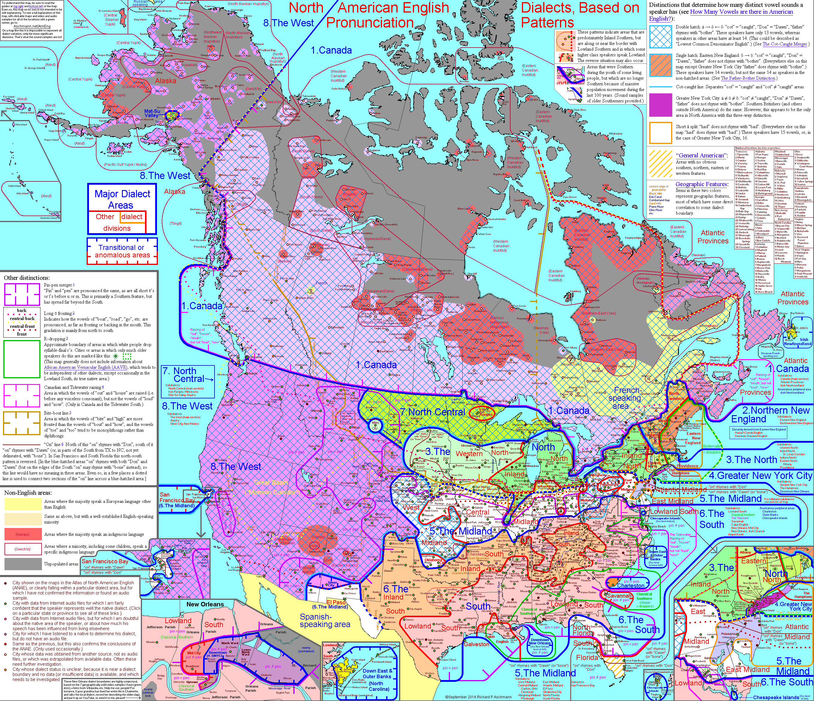
American dialects
This chart of American dialects was put together by Rick Aschmann as a hobby, but the level of detail is extraordinary, and makes playing around with the larger, interactive version a must. The map itself is just the tip of the iceberg. Aschmann has a detailed table outlining the distinctions between the various dialects represented here, over 900 audio examples for them, and much, much more. What I found most surprising was the contiguity of the "Inland South" dialects, which goes from the southernmost tip of West Virginia all the way down to eastern New Mexico and much of Texas. -
Northern cities novel shift
Vowels sound different around the Great Lakes. Penn linguist William Labov started documenting the way short vowels were used in cities like Syracuse, Cleveland, Detroit, Buffalo, and Chicago, and noticed that the way that, say, "block" was pronounced started to resemble the way the rest of the country says "black." More than that, the changes caused a chain reaction. "Buses" started to sound more like "bosses." To make the "o" sound that used to be part of "block," you now used a "u" instead of an "o." The map shows which areas have adopted various stages of that chained vowel shift.Here's a more detailed explanation, and here are a number of examples of the shift in action. -
Coke v. pop v. soda
You knew this was coming. Perhaps the most famous map of language disparities within the US, this map by Joshua Katz (now of the New York Times) uses data from the Harvard Dialect Survey to show what people in different regions of the US use as a generic term for sugary, carbonated beverages. It's a good reminder that while the US is linguistically cohesive compared to a lot of places, there are still revealing differences. -
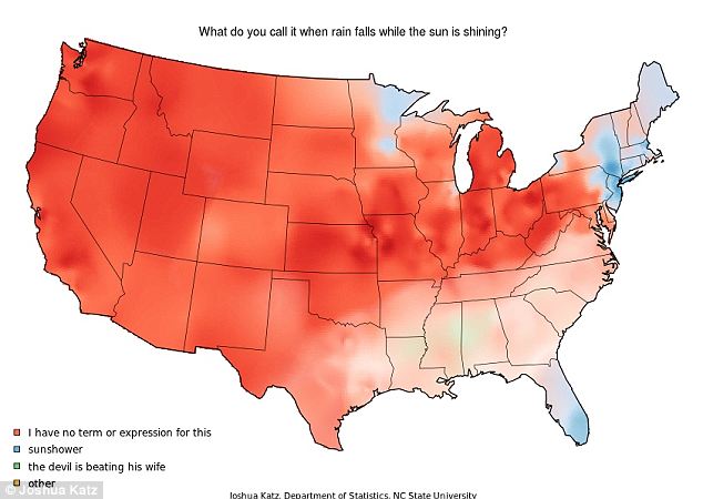
Sunshowers
At least nearly all Americans have a term for soda (or coke or pop or whatever). The phenomenon this other map of Katz's is about — it raining while the sun is out — doesn't have a specific term associated with it in most of the US. In Minnesota, southern Florida, and parts of the Northeast, it's referred to, benignly, as a "sunshower." It gets weird in central Alabama and Missisippi, where "the devil is beating his wife" is apparently a thing people say, raising all kinds of theological questions in the process.


No comments:
Post a Comment