The Greatest Paper Map of the United States You’ll Ever See.
Made by one guy in Oregon.
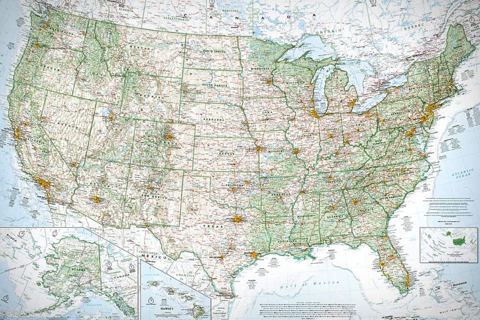
At first glance, Imus’ “The Essential Geography of the United States of America” may look like any other U.S. wall map. It’s about 4 feet by 3 feet. It uses a standard, two-dimensional conic projection. It has place names. Political boundaries. Lakes, rivers, highways.
Imus map of the United States.
So what makes this map different from the Rand McNally version you can buy at a bookstore? Or from the dusty National Geographic pull-down mounted in your child’s elementary school classroom? Can one paper wall map really outshine all others—so definitively that it becomes award-worthy?
These days, almost all the data cartographers use is provided by the government and is freely available in the public domain. Anybody can download databases of highways, airports, and cities, and then slap a crude map together with the aid of a plotter. What separates a great map from a terrible one is choosing which data to use and how best to present it.I’m here to tell you it can. This is a masterful map. And the secret is in its careful attention to design.
How will you signify elevation and forestation? How will you imply the hierarchy of city sizes? How big must a town (or an airport, or a body of water) be to warrant inclusion? And how will you convey all of this with a visual scheme that’s clean and attractive?
According to independent cartographers I spoke with, the big mapmaking corporations of the world employ type-positioning software, placing their map labels (names of cities, rivers, etc.) according to an algorithm. For example, preferred placement for city labels is generally to the upper right of the dot that indicates location. But if this spot is already occupied—by the label for a river, say, or by a state boundary line—the city label might be shifted over a few millimeters. Sometimes a town might get deleted entirely in favor of a highway shield or a time zone marker. The result is a rough draft of label placement, still in need of human refinement. Post-computer editing decisions are frequently outsourced—sometimes to India, where teams of cheap workers will hunt for obvious errors and messy label overlaps. The overall goal is often a quick and dirty turnaround, with cost and speed trumping excellence and elegance.
By contrast, David Imus worked alone on his map seven days a week for two full years. Nearly 6,000 hours in total. It would be prohibitively expensive just to outsource that much work. But Imus—a 35-year veteran of cartography who’s designed every kind of map for every kind of client—did it all by himself. He used a computer (not a pencil and paper), but absolutely nothing was left to computer-assisted happenstance. Imus spent eons tweaking label positions. Slaving over font types, kerning, letter thicknesses. Scrutinizing levels of blackness. It’s the kind of personal cartographic touch you might only find these days on the hand-illustrated ski-trail maps available at posh mountain resorts.
A few of his more significant design decisions: Your standard wall map will often paint the U.S. states different colors so their shapes are easily grasped. But Imus’ map uses thick lines to indicate state borders and reserves the color for more important purposes—green for denser forestation, yellow for population centers. Instead of hypsometric tinting(darker colors for lower elevations, lighter colors for higher altitudes), Imus uses relief shading for a more natural portrait of U.S. terrain.

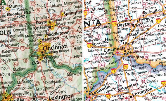
Left: Imus map of Cincinnati. Right: National Geographic map of Cincinnati
Consider these two views of the Cincinnati area. On the right, a National Geographic map employs a featureless white background and arbitrarily colors the state borders purple, green, and orange. On the left, Imus’ map uses a thick green line to indicate all state boundaries—allowing us to more easily recognize that it’s the Ohio River that defines those boundaries. Meanwhile, Imus uses colored shading to reflect the relative forestation level of the area and to accurately capture its gently rolling terrain.
Imus has also taken care to ensure that his map is densely packed with useful information yet still easy to read. Every major locale gets a list of key attractions such as universities, museums, and neighborhoods. Every airport gets its three-letter code.

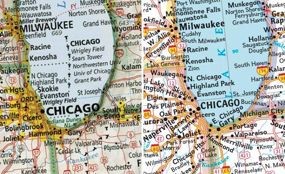
Left: Imus map of Chicago. Right: National Geographic map of Chicago
Consider Imus’ take on Chicago. Imus’ map, on the left, includes a list of the city’s major attractions and institutions. The thick black T’s trace the time-zone division as it snakes its way east of Gary and then bisects Lake Michigan. The red dotted line marked “FY” indicates a ferry route between Milwaukee and Muskegon. Imus omits some the smaller towns included on the National Geographic map on the right, making thoughtful choices to provide a richer portrait of the area’s culture and geography.
The longer you look at Imus’ map, the more deeply you feel the complexity and the artistry. It comes out of a tradition in which maps were made by hand using hot wax and X-Acto knives. You have no doubt that every tiny decision on Imus’ map was made for a reason.
Other mapmakers I spoke with marveled at the handcrafted beauty of the thing. (One guy reminisced about a Soviet map from the 1970s that used different colors for freshwater and saltwater lakes. He said Imus’ map achieves that level of specificity.) This is an example of heartfelt, artisanal cartography coming from a pro at the top of his game.
Yet, barring a miracle, this opus will barely be seen. Specialty map shops are disappearing. Bookstore chains tend to carry only the major map brands. And even if they were somehow made aware of Imus’ marvelous creation, most school systems can’t afford or can’t be bothered to update their classroom maps. A map is a map, right? That circa 1982 Rand McNally wall blob does the job just fine, the thinking goes.
Some might argue that classrooms don’t need paper maps at all. That none of us do. The Internet is full of free digital maps that boast amazing functionality. They can dictate driving directions, or help us find stores and hunt for real estate. We can look at these maps on the move—on our mobile phones or on the navigational systems in our cars. What good is an unwieldy paper wall map that can’t be pinched, zoomed, or double-clicked?
For one thing, that zooming capability means the makers of a single digital map are forced to design dozens of differently scaled versions. This severely limits how much time they can devote to perfecting the layout at each zoom level. Imus’ map never varies from its scale of 65 miles to the inch, but everything you see at that one scale is exactly as Imus wishes you to see it. Besides, if you need to zoom in on a wall map you can just tiptoe closer to the wall.
There’s also a certain flavor of geographic comprehension that comes with taking in a map all at once in a large format. Imus argues that you can’t truly understand a place if you only use zoomed-in maps on teensy screens. (Evidence for this notion: Although we probably look at maps now more than at any other time in history—thanks to their digital ubiquity—our knowledge of geography hasn’t improved at all. Studies show that our kids continue to live in geographic ignorance, in some cases worse than it was 15 years ago.) Looking at Imus’ big, richly detailed map offers a holistic sense of what America looks like—how cities spread out along rivers, forests give way to plains, and mountains zigzag next to valleys. In Imus’ exuberant view, a map like this might inspire enough geographic curiosity to guide the next generation of students back on course.
Finally, there’s that simple, ancient joy of paper. The joy one derives from paging through a crisp hardcover book instead of switching on a Kindle. From doing the crossword in ink, on newsprint, instead of typing it into an iPad app. Can we agree that one needn’t be a Luddite to recognize these small pleasures?
This object—painstakingly sculpted by a lone, impractical fellow—is a triumph of indie over corporate. Of analog over digital. Of quirk and caprice over templates and algorithms. It is delightful to look at. Edifying to study. And it may be the last important paper map ever to depict our country.
Surely that’s worth some space on the wall of your den?
Surely that’s worth some space on the wall of your den?
***
Imus' website: http://imusgeographics.com/
***
Imus interviewed by Dick Gordon: http://thestory.org/archive/the_story_052112.mp3/view
MAPPING AMERICA
Mapmaker Dave Imus looked at the maps he could find of the country and set out to create a better one - one that delineates the states and rivers and forests better. His map, which won "Best if Show" in a prestigious map making competition, reminded us of the poem "In the Elementary School Choir."
Music in this show: "Slow Guitar" by William Pasley and "Jakolando" by Hera Ma Nono.
No comments:
Post a Comment