Per Capita Healthcare Spending
The United States spends twice as much for lower longevity than every other listed country.
***
My friend and colleague John Walkenbach pointed me to a post from National Geographic called The Cost of Care, which compared health care spending with life expectancy for a number of countries. John asked how I would display this data.
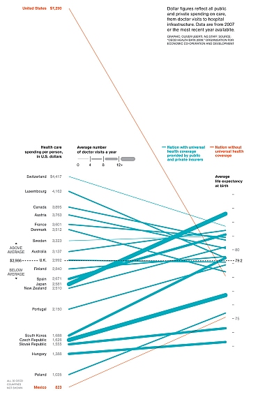
The article shows a line chart with a line connecting a country’s health care spending on the left axis with its life expectancy (at birth) on the right axis. The US and Mexico are colored differently because they do not have “Universal” health coverage. Thicker lines indicate more doctor visits per person per year. Click on the chart for a full sized version.
The Original Chart
This chart was mentioned in Not the best time for a parallel coordinate plot . . . but it’s not actually so bad here by Andrew Gelman, who thought the chart wasn’t terrible, but wondered why they selected these specific countries for the chart.
Evan Falchuk was more critical in Warning: Graphic Politics. Evan noted that there were no apparent correlations between life expectancy and spending, number of doctor visits, or whether there was universal coverage. Evan also asked whether spending was even relevant to the quality of health care.
None of the critiques of the chart mentioned the effect of malpractice insurance on health care costs, though one response to Falchuk’s post mentions defensive medicine. It’s more complicated than the US being ripped off, and anyway, that’s a political discussion for another place and time.
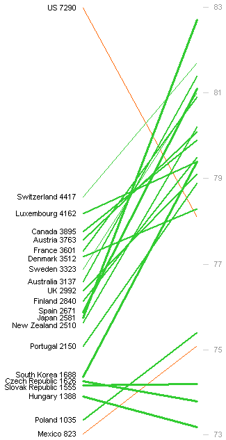
John asked me when he sent me the original link how else I might graph the data. We agreed that the purpose of the original chart was to show the huge spending in the US, compared to its life expectancy, in as dramatic fashion as possible. To take away some of the drama, I redrew the line chart with more equal spreads in the respective Y axes. You could tweak the scales even more to reduce the relative steepness of the lines, or make the chart wider and less tall.

The chart is still a bit dramatic, but not as outrageous. The extreme slopes of most of the lines are just a distraction. As noted above by Evan Falchuk, this chart shows no correlation between the two main variables in the study. Not surprising, because the correlations are weak. Also not surprising, since it’s not a very effective way to show a correlation.
The New Chart
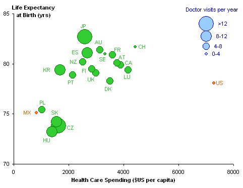
The best way to show correlation between two variables is in an XY chart. I got into Chart Busters mode, and plotted X=spending and Y=life expectancy in the following chart. The US and Mexico are colored differently to highlight their non-universal-coverage status, and data points are sized to reflect the number of doctor visits.

The US is an obvious far outlier. You can imagine an upward slope in the green markers, perhaps steeper than 45° in this plot. The correlation is not really strong, nor is it negligible. Excluding the US, the R² value is 0.52 including Mexico and 0.48 excluding Mexico.
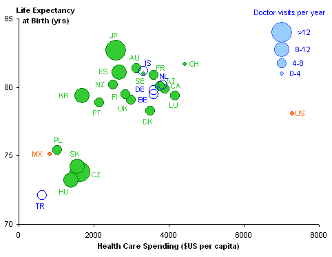
A commenter to the National Geographic post listed a handful of other countries, which I’ve included in the XY chart below:

Inclusion of these countries increases R² to 0.56, probably since most of them fall within the dense upper range of the previously included countries, and one point, Turkey, falls below and left of the rest. In all of the regressions, the slope of the line is 1.9 years per $1000 of spending, and the Y-intercept implies that we’d live to 73.5 without spending a dime. At the level of spending of the US, the relationships predict a life expectancy of 87.5 years.
What’s the takeaway?
First, the XY chart shows the correlation between spending and life expectancy much better than does the line chart, without nearly as much drama. The US still shows a dramatic divergence from the other countries, spending more than twice as much for a slightly below average life expectancy. We’ll leave debate about the reasons for this divergence for the political blogs.

No comments:
Post a Comment